Competitive deals have become the norm in B2B sales. According to industry research, more than 70% of B2B deals involve active competition, and that number continues to climb. When a prospect mentions a competitor mid-deal, your sales rep has seconds – not minutes – to respond with confidence.
This is the moment battlecards are supposed to serve. They’re designed to arm your reps with the competitive intel, insights and objection handling strategies they need. So that when they are on a call, they don’t flinch mid-pitch if an objection is raised.
Yet most battlecards fail spectacularly at this job.
The problem isn’t always the intelligence itself. Competitive intelligence teams spend weeks gathering insights, documenting differentiators, and crafting positioning statements. The failure often happens in the design – how that intelligence is packaged, structured, and delivered to the people who need it.
“We’ve seen customers move over from other solutions who felt in a bind after watching their reps fumble through 15-page battlecard PDFs while preparing for their next call,” says Paul Towers, Founder and CEO of Playwise HQ. “By the time they found what they needed, they barely had any time to digest the insights before the call started. Great intelligence trapped in poor design is worse than useless – it creates the illusion of support while actually leaving reps exposed.”
The most common battlecard design failures fall into predictable patterns:
- Documents that are too long to scan
- Layouts that are too cluttered to navigate
- Formats that are too static to stay current, and
- Structures too disconnected from real selling scenarios.
This guide breaks down the best practices for battlecard design, focusing on the three elements that determine whether your competitive intelligence actually gets used: layout, length, and format. Each principle is grounded in how sales reps actually work under pressure, not how we wish they worked.
Why Design Matters More Than Content Quality
The uncomfortable truth about battlecards is that design determines adoption more than content quality. You can invest months in gathering competitive intelligence, conducting win/loss interviews, and crafting perfect positioning statements. None of it matters if reps can’t access the information in the 10 seconds they have during a live call.
This is what we call the “10-second rule”: sales reps decide within 10 seconds whether a battlecard will help them or not. If they can’t immediately find relevant information, they won’t scroll, search, or explore. They’ll wing it, make something up, or deflect the competitive question entirely.
Information architecture determines adoption. The best content in the world fails when it’s buried beneath walls of text, hidden in confusing navigation, or formatted in ways that require study rather than scanning.
“Think about how reps actually use battlecards,” explains Towers. “They’re preparing for a call, they know a competitor is active in the account, and they need insight now. They’re not going to read through your beautiful prose about market positioning. They need the specific objection response or differentiator they can understand in the next 30 seconds. Design either enables that or it doesn’t.”
This is why many battlecard programs fail despite having solid competitive intelligence. The content exists. The design prevents it from being useful.
The Science of Scanning: How Reps Actually Use Battlecards
Understanding how people scan documents transforms how you design battlecards. Eye-tracking research consistently shows that users don’t read documents linearly – they scan in predictable patterns, typically following an F-pattern or Z-pattern depending on layout.
But sales reps operate under additional constraints that make scanning behavior even more pronounced. During competitive conversations, they’re simultaneously listening to the prospect, formulating responses, managing the call flow, and searching for information. This multitasking context means battlecard content must be instantly accessible.
When reps reach for a battlecard, they’re looking for specific things in a specific order:
- First: A quick answer to their immediate question. If a prospect just mentioned Competitor X’s new pricing, the rep needs that specific response, not a general competitive overview.
- Second: A talk track they can use and make their own. Recommended talk tracks give reps the main talking points, while still giving them flexibility to make it sound like their own.
- Third: A proof point to back up a claim. After making a competitive statement, reps often need supporting evidence – a customer example, a statistic, or a third-party validation.
These scanning priorities have direct implications for battlecard design. The most important information must be visually prominent. Talk tracks should be formatted as ready-to-use language, not embedded in paragraphs. Proof points need to be associated with specific claims, not buried in separate sections.
Layout Principles That Drive Battlecard Usage
Layout is the structural foundation of battlecard usability. The right layout makes information discoverable. The wrong layout makes even brilliant intelligence invisible.
Principle 1: Above-the-Fold Priority
The most critical battlecard real estate is what’s visible without scrolling- what we call “above the fold.” This prime space determines whether a rep continues engaging with the battlecard or abandons it entirely.
What belongs above the fold:
- Competitor name and visual identifier for instant confirmation
- Short overview or positioning summary that captures your core advantage
- Main strengths / weaknesses in scannable format
What can go below the fold: detailed competitive analysis, comprehensive objection libraries, deep-dive technical comparisons, and historical context. This information is valuable but not urgent – reps can scroll (or tab) to it.
“We structure every Playwise HQ battlecard around this above-the-fold principle,” notes Towers. “The first thing a rep sees provides clear guidance on who the competitor is and how they position themselves in the market. Beyond that the overview tab gives the rep all the key insights they need if they were to only “read one thing” about a given competitor”.
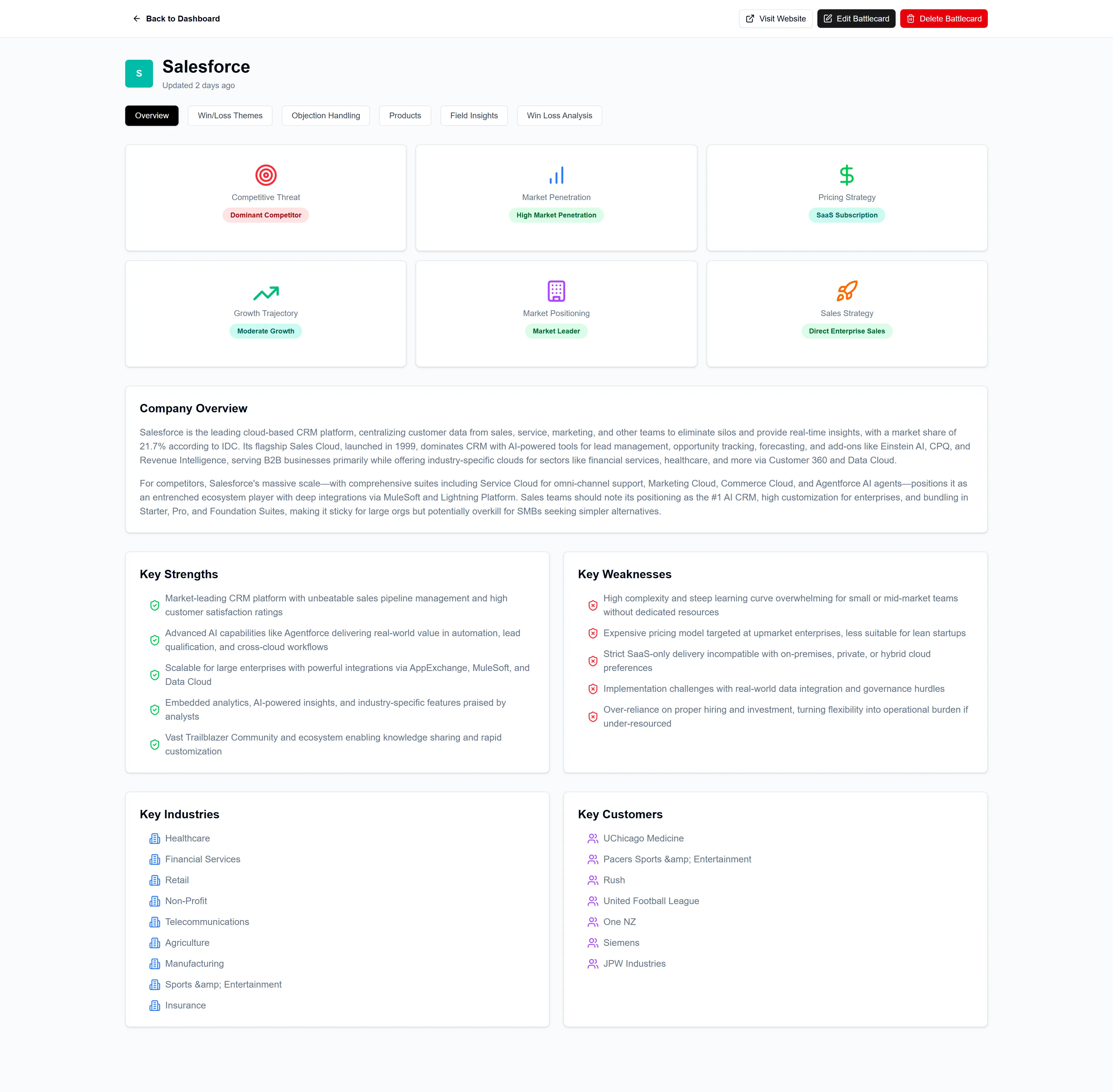
Principle 2: Consistent Structure Across All Battlecards
Consistency is a force multiplier for battlecard adoption. When every battlecard follows the same structural pattern, reps learn the format once and can apply that knowledge across all competitors. This reduces cognitive load and increases speed.
Recommended section order (same for every competitor):
- Quick reference summary
- Key differentiators
- Competitor strengths (acknowledged honestly)
- Competitor weaknesses (specific and provable)
- Common objections with responses
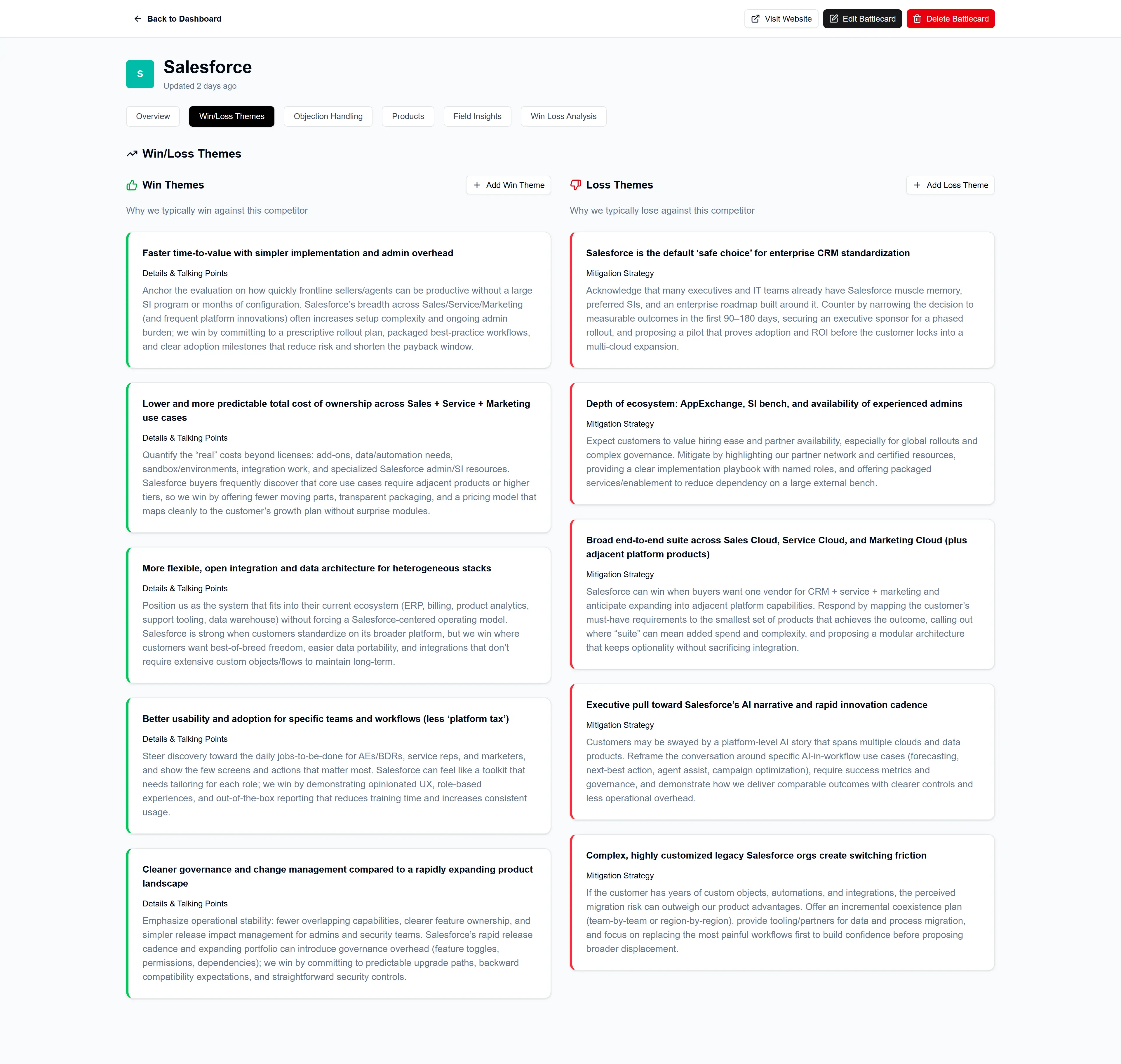
- Proof points and customer evidence (Win / Loss Themes)
- Product Overviews
This consistent structure means reps always know where to look for specific information. The objection responses are always in the same place. The insights from competitive wins (and losses) are always formatted the same way. This predictability is a feature, not a limitation.
Playwise HQ enforces this consistency through tabbed sections that appear in the same order for every competitor: Competitor Overview, Objections & Responses, Win/Loss Themes, and Competitor Product Comparisons. Reps know exactly where to find what they need regardless of which competitor they’re facing.
Principle 3: Visual Hierarchy Through Typography
Typography creates visual hierarchy that guides scanning behavior. When done well, reps can understand the structure of information before reading a single word.
Effective typographic hierarchy uses:
- Header levels that create scannable structure: H1 for competitor name, H2 for major sections, H3 for subsections
- Bold for key terms, not entire sentences: Bolding everything means nothing stands out
- Appropriate font sizes: Body text at 14-16px minimum, with clear differentiation between header levels
- Strategic use of emphasis: Italics for talk tracks that can be used verbatim
The “squint test” is a useful design check: if you squint at your battlecard, can you still see the structure? If the entire document blurs into an undifferentiated mass of text, your visual hierarchy needs work.
Principle 4: Strategic Use of Color
Color coding can accelerate information retrieval when used consistently. A common approach:
- Green for your advantages and things to emphasize
- Red for competitive threats and things to avoid
- Blue for neutral information and facts
The danger is overusing color. Too many colors create visual noise that slows comprehension rather than speeding it. Limit your palette to three or four colors maximum, and use them consistently across all battlecards.
Playwise HQ uses color strategically. For example to draw attention to Win/Loss themes.
Principle 5: White Space Is Not Wasted Space
Cramped layouts cause scanning failure. When every inch of a battlecard is filled with text, the eye has nowhere to rest, and nothing stands out. White space – the empty area between elements—is a design tool that improves comprehension.
Guidelines for effective white space:
- Generous margins around the document edge
- Clear spacing between sections
- Padding within content blocks
- Room around headers for visual separation
The paradox is that less content, better formatted, produces more usage than comprehensive content that’s difficult to navigate. Reps will engage with a clean, scannable one-page battlecard far more readily than a dense five-page document.
Principle 6: Tabbed Navigation for Instant Access
For battlecards delivered digitally, tabbed navigation eliminates scrolling and enables instant access to specific sections.
Playwise HQ battlecards use a tabbed structure that lets reps jump directly to:
- Competitor Overview: Positioning, key differentiators, market narrative
- Objections & Responses: Real objections reps hear with tailored rebuttals
- Win/Loss Themes: Patterns from actual deals showing why you win and lose
- Product Comparisons: Feature-level analysis for head-to-head evaluations
“Sales reps don’t study battlecards – they reach for them in the moments prior to a call or meeting” explains Towers. “Tabs reduce scrolling, eliminate hunting, and support fast recall under pressure. Every second saved is a second the rep can focus on the conversation ahead.”
Length Guidelines: Conciseness Wins Deals
The most common battlecard failure is information overload. Competitive intelligence teams, understandably proud of their research, try to include everything they’ve learned. The result is what we call the “competitive PDF graveyard” – comprehensive documents that no one actually uses.
The One-Page Rule
High-performing battlecard programs embrace the one-page rule: all essential information must fit on a single screen with minimal scrolling. This constraint forces ruthless prioritization and produces content that’s actually usable in live situations.
What fits on one page (and what doesn’t):
Keep on the overview page:
- Positioning summary (how the competitor positions themselves in the market)
- Company Overview (through the lens of what’s relevant for a sales person to know)
- 3 – 5 key strengths and weakness
- 3 – 5 key industries and customers they have
Move to secondary resources:
- Complete company background and history
- Exhaustive feature comparisons
- Full pricing documentation
- Detailed technical specifications
This doesn’t mean longer content has no value – it means longer content should live in linked resources rather than cluttering the primary battlecard.
In Playwise HQ the use of a tabbed layout helps create a clear separation of information. That way if a rep just needs the most up-to-date information on common objections they know to immediately navigate to that tab and can skip the rest.
The “Could a Rep Use This on a Call?” Test
Every piece of content should pass this filter: could a rep realistically use this information during a live call?
If you can’t read it in 60 seconds, it’s too long. If you can’t find a specific answer in 10 seconds, it needs restructuring. If it requires interpretation or synthesis before use, it’s not actionable enough.
“Too much content creates hesitation, not confidence,” notes Towers. “When a rep opens a battlecard and sees a wall of text, their brain immediately signals: ‘I don’t have time for this.’ We focus on sharp summaries, rep-usable answers, and only what matters in deal conversations.”
Actionable Insights Over Generic Information
A good battlecard doesn’t just explain competitors – it tells reps what to do next.
Every section should answer:
- What should I say?
- What should I avoid?
- What’s the strongest positioning angle?
Compare these two approaches to documenting a competitor weakness:
Generic (not actionable): “Competitor X was founded in 1998 and has raised $50M in funding across multiple rounds including Series A through C.”
A more actionable way to think about this is:
- Competitor X is 25 years old
- Legacy architecture limits modern integrations
- Therefore the usable insight for a sales rep is “While they’ve been around a long time, their platform wasn’t built for today’s API-first world. That’s why customers often struggle with integrations that work seamlessly with our solution.”
The second version gives reps a specific talking point they can use immediately. The first version is trivia.
Word Count Guidelines by Section
When building battlecards, these word counts produce scannable, usable content:
Format: Designing Battlecards for Real Sales Execution
Format encompasses how battlecards are delivered, displayed, and accessed. The right format removes friction between reps and the information they need.
Digital-First Design
Most battlecard usage happens on screens – laptops during desk work, tablets during meetings, phones when traveling. Design must prioritize digital consumption:
Screen optimization:
- Horizontal scroll is unacceptable
- Content must be readable without zooming
- Links should be clickable, not text references
- Search functionality for quick information retrieval
Mobile considerations:
- Field sales teams frequently access battlecards on phones
- Content should stack vertically on narrow screens
- Key information should remain visible in portrait orientation
Interactive elements:
- Expandable sections for detailed information
- Linked proof points and case studies
- Embedded videos for complex demonstrations
- Shareable snippets for follow-up emails
Clear, Intuitive UX Under Pressure
The best battlecard design is invisible. Reps should never need training to find answers. The interface should be so intuitive that first-time users can navigate effectively.
This means:
- Predictable navigation patterns
- Clear visual indicators for different content types
- Consistent placement of recurring elements
- Obvious pathways to deeper information
Playwise HQ battlecards are built around this principle of speed-first usability. The tabbed structure, consistent formatting, and visual hierarchy mean reps can find what they need without thinking about how to find it.
Visual Highlights and Signal Boosting
Within the battlecard format, certain techniques surface the most critical information:
- Bold callouts for key terms and differentiators
- Highlight blocks for talk tracks and ready-to-use language
- Comparison tables for feature-by-feature analysis
- Color coding for quick visual categorization
- Icons to distinguish content types at a glance
The goal is to make the “gold” instantly visible. When a rep glances at a battlecard, the most important information should pop immediately.
Consistency Across Every Battlecard
Format consistency compounds over time. When every battlecard follows the same design system, several benefits emerge:
- Trust: Reps learn to rely on the format because it’s predictable
- Speed: Navigation becomes muscle memory rather than conscious effort
- Usage: Lower friction means more frequent access
- Onboarding: New reps learn one system that works everywhere
This is why Playwise HQ standardizes formatting so every competitor card feels instantly usable. Whether facing a major enterprise rival or a small emerging competitor, the battlecard structure remains consistent.
Leveraging Playwise HQ’s Battlecard Structure
Playwise HQ was designed from the ground up around these battlecard design principles. Every feature reflects what we’ve learned about how reps actually use competitive intelligence under pressure.
Competitor Overview Tab: Context at a Glance
The Competitor Overview tab provides instant grounding before deeper competitive conversations. It consolidates:
- Positioning summary
- Key company overview written through a lens of what’s relevant to a sales person
- Key strengths and weaknesses
- List of customers and industries
This tab answers the question: “What do I need to know about this competitor in 30 seconds?”
Objections & Recommended Responses
Real objections require real responses. The Objections tab lists the objections reps actually hear in the field – not theoretical concerns, but the specific pushback that comes up in live deals.
Each objection includes:
- The objection as prospects phrase it
- Recommended response language
- Supporting proof points
- Landmines to avoid
“We make objection handling practical, not theoretical,” notes Towers. “Every response is designed to be reps. Reps shouldn’t have to translate marketing (or product) speak into their own – they should be able to speak to how you recommend handling the objection directly.”
Win/Loss Themes: Learning From Deal History
Battlecards shouldn’t just reflect competitors – they should reflect your deals. The Win/Loss Themes tab captures patterns from actual competitive outcomes:
- Why deals are won against this competitor
- Where competitors land punches
- What patterns repeat across multiple opportunities
- Specific scenarios where you have advantage or disadvantage
This transforms battlecards from static competitive research into dynamic strategic tools informed by real selling experience.
Competitor Product Comparisons
Feature-level comparisons matter most when buyers evaluate head-to-head. The Product Comparisons tab enables structured product mapping for direct selling moments:
- More detailed information on specific products.
- Strengths and weaknesses that are specific to individual competing products.
- Links to product specific supporting information
Additional Capabilities
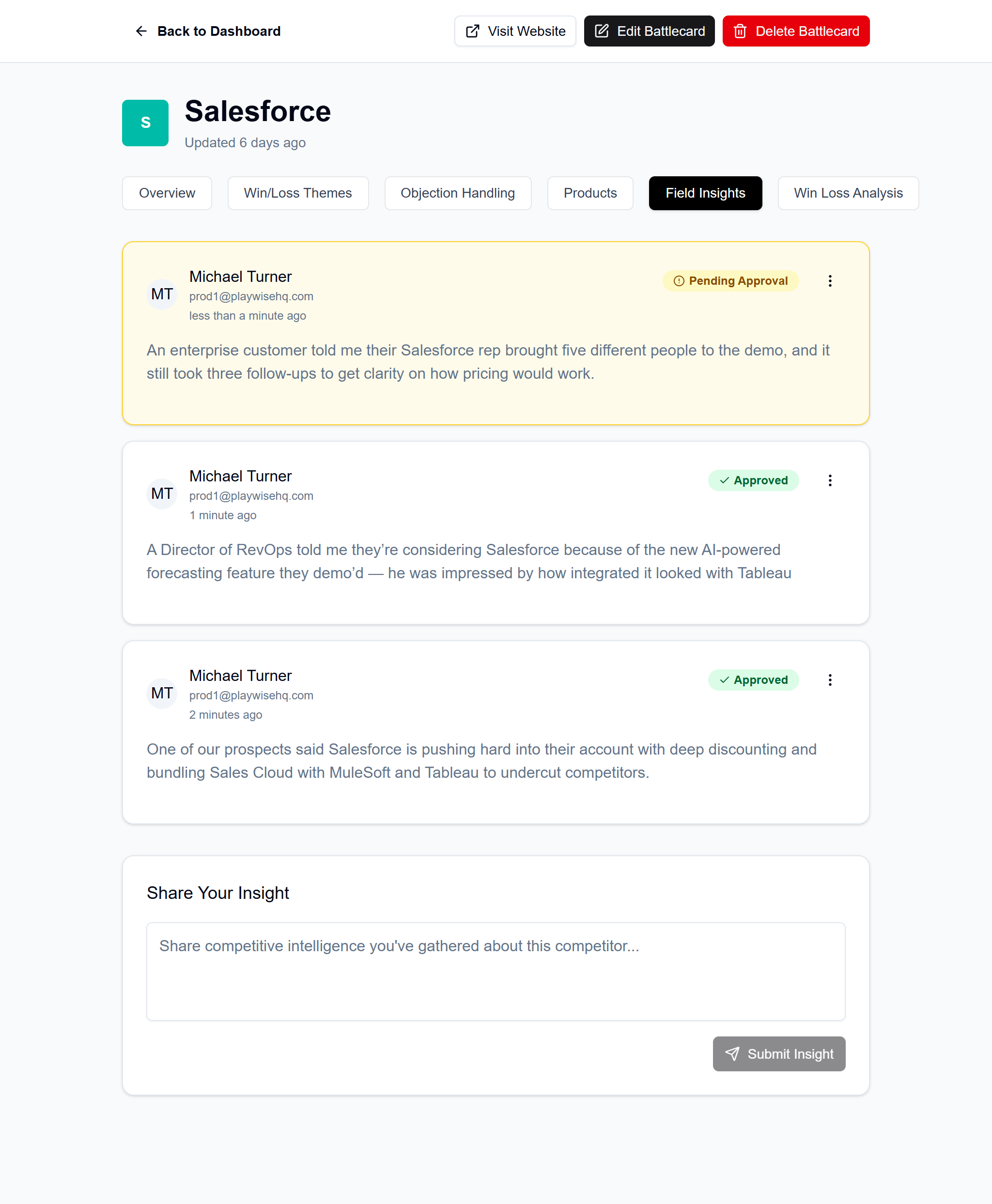
One of the other advantages of adopting a platform like Playwise HQ is that it is a live system. This means each battlecard can take advantage of other information that is useful to a sales rep.
In Playwise HQ this includes a dedicated tab for rep-sources sales intelligence. This is where sales-reps can directly contribute what they are hearing in the field back into the battlecard itself.
Second, with Playwise HQ you can directly record competitive wins and losses (and have those sync to CRMs like Hubspot and Pipedrive). That way reps can dive into individual deals (perhaps those that involved a prospect in a similar industry) to really understand what drove your success (or loss) in that instant.
Common Battlecard Design Mistakes
Even well-intentioned battlecard programs fall into predictable design traps. Avoiding these mistakes is often more impactful than implementing new best practices.
Mistake 1: Walls of Text With No Visual Breaks
Dense paragraphs are the fastest way to kill battlecard adoption. When reps open a document and see undifferentiated blocks of text, they immediately disengage. Content must be broken into scannable chunks with clear visual separation.
Mistake 2: Inconsistent Formatting Across Battlecards
When every battlecard follows different structural patterns, reps must relearn navigation for each competitor. This cognitive overhead reduces usage. Consistency in structure, typography, and visual design accelerates information retrieval.
Mistake 3: Important Information Buried Below the Fold
Critical insights hidden at the bottom of long documents rarely get seen. Above-the-fold content receives far more engagement than buried content. Prioritize ruthlessly and move supporting details to linked resources.
Mistake 4: No Clear Visual Hierarchy
When everything looks the same, nothing stands out. Headers should be distinct from body text. Key terms should be emphasized. Sections should be visually separated. The structure should be apparent from a glance.
Mistake 5: Tiny Fonts to Fit More Content
Shrinking font size to pack in more content is counterproductive. Reps won’t squint to read battlecards during calls. If content doesn’t fit, cut content—don’t shrink text.
Mistake 6: Poor Contrast and Readability
Light gray text on white backgrounds, decorative fonts, and low-contrast color schemes all reduce readability. Battlecards should prioritize legibility above aesthetics.
Mistake 7: No Quick-Reference Summary
Reps often need a single sentence or two capturing the essential competitive positioning. Without a quick-reference summary, they must synthesize information themselves – exactly what they don’t have time to do during calls.
Empowering Reps With Confidence
The ultimate goal of battlecard design is rep confidence. When reps trust their battlecards – when they know they can find reliable, actionable information in seconds – they enter competitive conversations differently.
Confident reps:
- Proactively surface competitive conversations rather than avoiding them
- Respond to competitor mentions with clarity rather than deflection
- Position effectively against rivals rather than defaulting to feature comparisons
- Close competitive deals rather than losing them to better-prepared competitors
“Competitive confidence wins deals,” observes Towers. “When a rep can smoothly handle any competitive objection because they trust their battlecards, prospects notice. That confidence translates directly into higher win rates.”
Playwise HQ equips reps with this confidence through:
- Clarity: Information structured for instant comprehension
- Trust: Content that reflects real competitive dynamics
- Instant responses: Talk tracks ready for immediate use
- Consistent positioning: Messaging that aligns across the entire sales organization
Real-World Impact
Teams using well-designed battlecards see measurable improvements in competitive outcomes. While results vary by organization, consistent patterns emerge:
- Faster objection handling: Reps resolve competitive objections in seconds rather than minutes
- Higher adoption: Clean, scannable battlecards get used; cluttered PDFs get ignored
- Fewer lost deals: Competitive conversations become winning moments rather than liability
- Reduced ramp time: New hires access the same intelligence that takes veterans years to accumulate
“We’ve seen customers achieve 27% win rate improvements after implementing Playwise HQ,” notes Towers. “The intelligence matters, but the design that makes it usable matters equally. You can’t separate content from delivery.”
Conclusion: The Battlecard Design Standard for Modern Sales Teams
Battlecard design is a strategic discipline, not a cosmetic concern. The principles are clear:
- Layout must be scannable. Reps need information in seconds, not minutes. Visual hierarchy, consistent structure, and above-the-fold prioritization determine whether battlecards get used or ignored.
- Length must be tight. The one-page rule forces prioritization that produces actionable content. Everything on a battlecard should pass the “could a rep use this on a call?” test.
- Format must be consistent. Predictable structure across all battlecards accelerates navigation and builds trust. Reps learn one system that works everywhere.
- Content must be actionable. Generic information doesn’t help reps win deals. Every section should answer: what should I say, what should I avoid, and what’s the strongest angle?
Playwise HQ embodies these best practices by building battlecards that stay live, stay usable, stay trusted, and actually show up in selling moments. The tabbed structure enables instant navigation. The consistent formatting supports rapid scanning. The AI-powered creation and real-time updates ensure content stays current.
The difference between competitive intelligence that wins deals and competitive intelligence that collects dust often comes down to design. Invest in getting the layout, length, and format right, and your intelligence investment multiplies. Get it wrong, and even brilliant insights remain trapped in documents no one opens.
Your sales team deserves battlecards designed for how they actually work. The competitive moment won’t wait for them to find the information they need.